Pops Digital logo with stylized letter P and colorful digital dots.

Pops Digital was born from a love of storytelling about the community. What started in the living room with a camera, a dream, and a palpable energy that grew into a creative house producing meaningful work. We build narratives that look like us, sound like us, and feel like home.

What People Are Saying

  • Strategy Meets Creativity

    At Pops Digital, we leverage over 30 years of combined business acumen and marketing expertise to help brands think bigger and move smarter. We don’t just design—we strategize. From the earliest brainstorming sessions to full scale execution, we work alongside you to shape a clear, actionable vision for your business.

    Our process is built to meet you exactly where you are today—whether you’re launching, rebuilding, or refining, while also preparing your brand for where it’s going next. As momentum builds and growth starts to happen, our strategies evolve with you, ensuring your branding, messaging, and marketing infrastructure can scale without losing authenticity.

    We blend creative branding with real world business insight, delivering purposeful brand identities, logo systems that stand the test of time, and rollout strategies that actually convert. From social media programming and content direction to campaign planning and long term growth storytelling, everything we build is rooted in intention, adaptability, and impact.

    Pops Digital isn’t just about making things look good, we help build brands that grow with confidence and clarity.

  • The Art of Storytelling

    At Pops Digital, storytelling is at the heart of everything we create. We believe every brand has a story worth sharing, and our role is to transform yours into meaningful digital experiences that connect with the people you’re built to serve.

    We bring your story to life across video, photography, web design, social media, digital content, and integrated brand campaigns. Every image, color, frame, and message is thoughtfully created to reflect who you are, what you stand for, and why your work matters.

    Our approach isn’t driven by trends or one-size-fits-all templates. It begins with understanding your voice, journey, audience, and purpose. From there, we build a cohesive digital presence that feels authentic, inspires connection, and strengthens your community.

    Pops Digital exists to help your story move—across platforms, between people, and toward what’s next.

  • Let’s work together.

    Every great project starts with a conversation.

    At Pops Production Co., we partner with brands, nonprofits, small businesses and creators who care about how their story is told. Whether you’re launching something new, refining your identity, or bringing a vision to life through video, design, or strategy, we meet you where you are—and help you move forward with clarity and purpose.

    Our process is collaborative, intentional, and rooted in real storytelling. No templates. No shortcuts. Just thoughtful creative work designed to connect, resonate, and last.

    If you’re ready to build something meaningful, let’s create it, together.
Companies we've worked with...

Companies we've worked with...
Black background with white text reading 'OFFSET'.
Logo for Kids In The Spotlight, featuring yellow text on a dark blue background with a circular design of children filming a movie scene.
Logo for Uptown Cheapskate
Red oval logo with white text saying "PICCINI" and smaller text below that reads "ITALIAN TAKEOUT".
South Bay Credit Union logo featuring a stylized 'S' with a gradient color scheme, and the text 'SOUTH BAY' in bold, with 'CREDIT UNION' underneath.
F/S logo with a vertical line dividing the letters F and S, enclosed in a circle.
Logo for Corridor Flow featuring a light bulb with a power plug inside and the words "Corridor Flow" with the tagline "Coffee, Community, Create"
A circular logo with the words 'Dadbod Apparel' around the outer edge. Inside, there are icons of a barbell, a key, and crossed lines forming an 'X' with the letters 'D' and 'B' on either side.
The logo of Amai with black lowercase letters and a pink star symbol.
Triton Gym logo with red trident and bold red text.
Logo for Two Guns Espresso featuring the text 'Two Guns' in black script and 'Espresso' in white inside a red circle
Logo for VEGA ER for Pets, featuring a red cross with a paw print in the center and the words 'VEG ER for Pets'.
Logo for Barshe Wines & Spirits Tasting Room in black and white.
Logo for 1736 Family Crisis Center with a house illustration and a red heart.
Skip to Videos
  • Brandyn Hernandez | In Motion — A Pops Production Co. Film
    • 9/5/26

    Brandyn Hernandez | In Motion — A Pops Production Co. Film

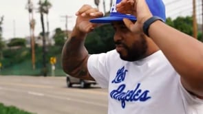
    This is Brandyn & Freddy in their element.

    Founder & CEO of Pops Production Co., Brandyn leads in front of the camera and Freddy behind the lens —moving between strategy, creativity, and community with relentless focus. Shot with dramatic pacing and kinetic visuals, this piece captures the energy behind the work: early mornings, late nights, hands-on leadership, and the constant push to build something meaningful.

    This isn’t about posing. It’s about progress.

    The grind. The vision. The responsibility of building brands, telling stories, and creating impact—day after day.

    At Pops Production Co., we believe great storytelling starts with action. This film reflects the mindset behind the company: purpose-driven creativity, disciplined execution, and an unwavering commitment to moving ideas forward.

    Built, not borrowed.

    Focused, not flashy.

    Always in motion.

    🎬 A Pops Production Co. Original

    📍 South Bay, CA

  • POPS PURPOSE | PRODUCT SHOOT — CHINATOWN, DOWNTOWN LOS ANGELES
    • 8/29/25

    POPS PURPOSE | PRODUCT SHOOT — CHINATOWN, DOWNTOWN LOS ANGELES

    Pops Purpose | Product Shoot — Chinatown, Downtown Los Angeles

    A Pops Production Co. Film

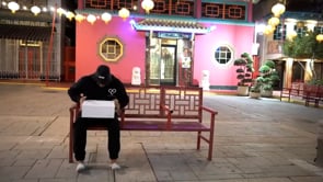
    Set in the heart of Chinatown, Downtown Los Angeles, this film captures a Pops Purpose product shoot through a cinematic lens—where culture, texture, and intention collide.

    Against the backdrop of historic storefronts, layered signage, concrete streets, and passing light, the products take on new meaning. Every frame reflects what Pops Purpose stands for: authenticity, community, and purpose-driven storytelling rooted in real places.

    Pops Production Co. approached this shoot with an emphasis on movement, contrast, and atmosphere—letting the environment inform the narrative and elevate the visual identity of the brand.

    This is more than a product shoot.

    It’s culture in context.

    Purpose, framed.

    📍 Chinatown — Downtown Los Angeles

    🎬 Produced by Pops Production Co.

  • In Transit | A Cinematic Study in Motion
    • 8/29/25

    In Transit | A Cinematic Study in Motion

    In Transit | A Cinematic Study in Motion

    A Pops Production Co. Film

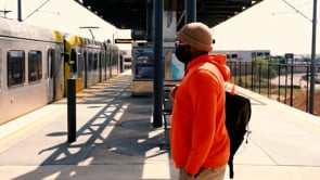
    Set against the rhythm of a moving train station, this film captures the poetry of motion—arrivals, departures, fleeting moments, and quiet resolve. Shot with cinematic framing and deliberate pacing, the video explores the space between where we are and where we’re going.

    This isn’t about the destination. It’s about momentum.

    The footsteps, the glances, the passing light, the constant hum of progress.

    At Pops Production Co., we use environment as narrative. This piece leans into texture, sound, and movement to tell a story without dialogue—proof that powerful storytelling lives in the details.

    Every journey leaves a mark.

    Every moment is in motion.

    🎬 A Pops Production Co. Original

    📍 Cinematic Visual Study